
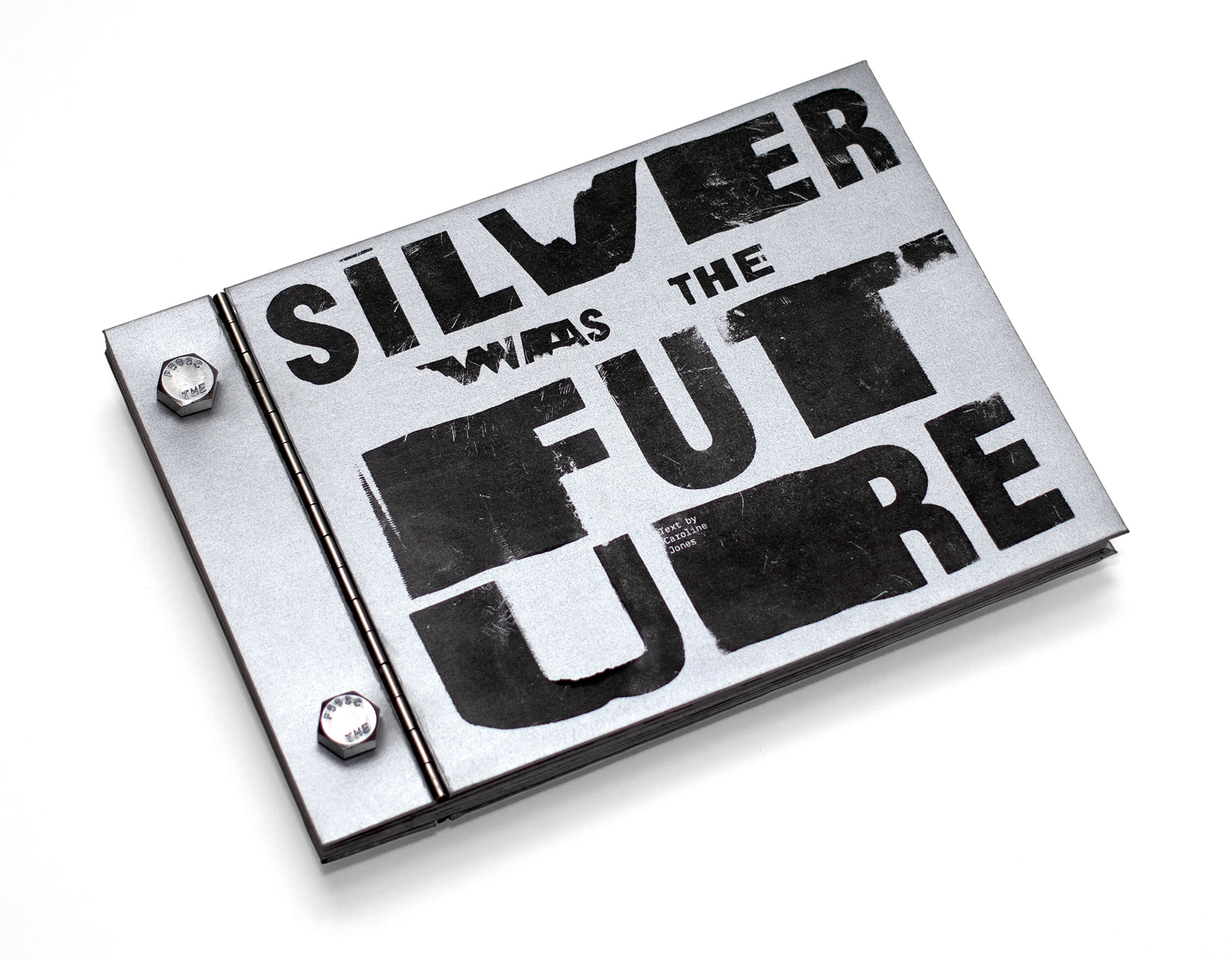
Silver Was the Future
Book Design
Recognition:
Gold Award | Graphis New Talent Annual 2020,
Runner-Up: Graphic Design Student | Creative Quarterly 60
Gold Award | Graphis New Talent Annual 2020,
Runner-Up: Graphic Design Student | Creative Quarterly 60
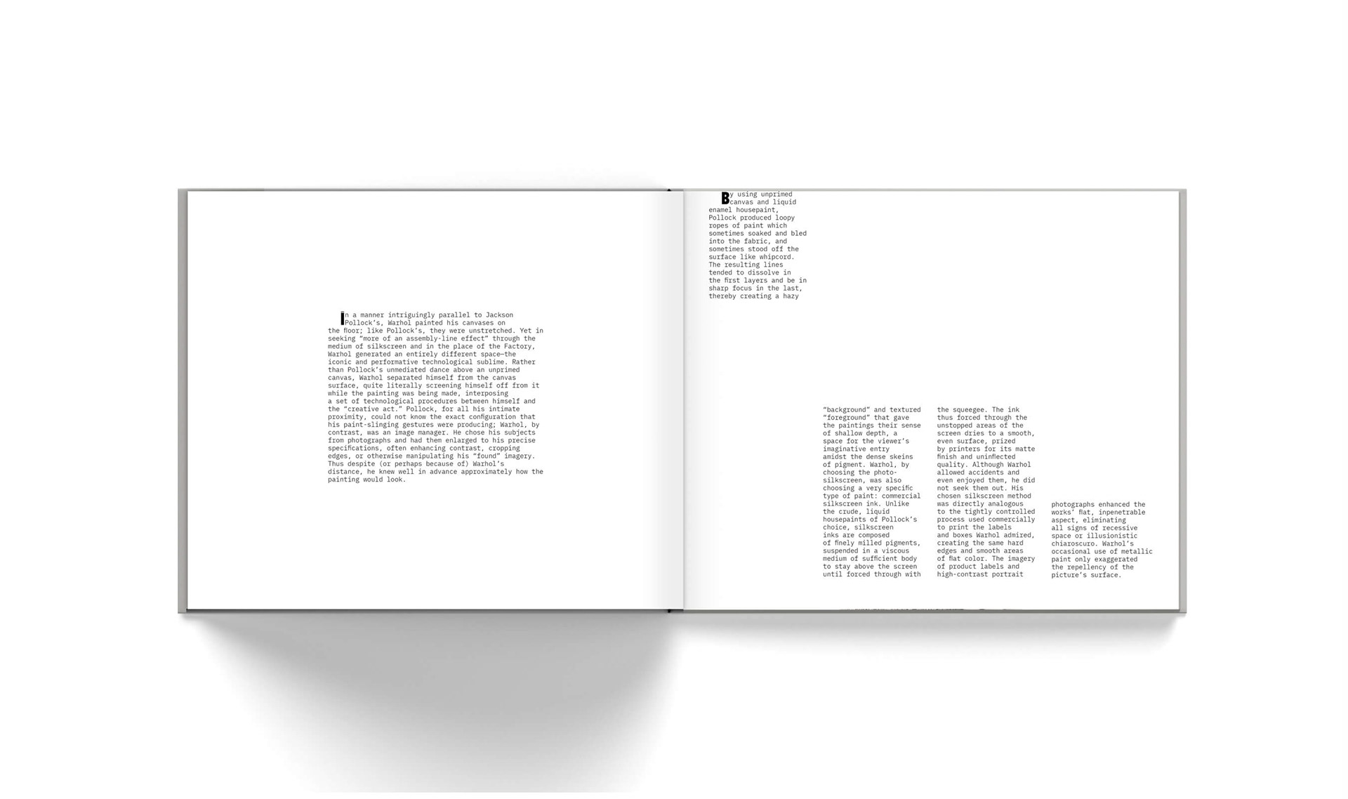
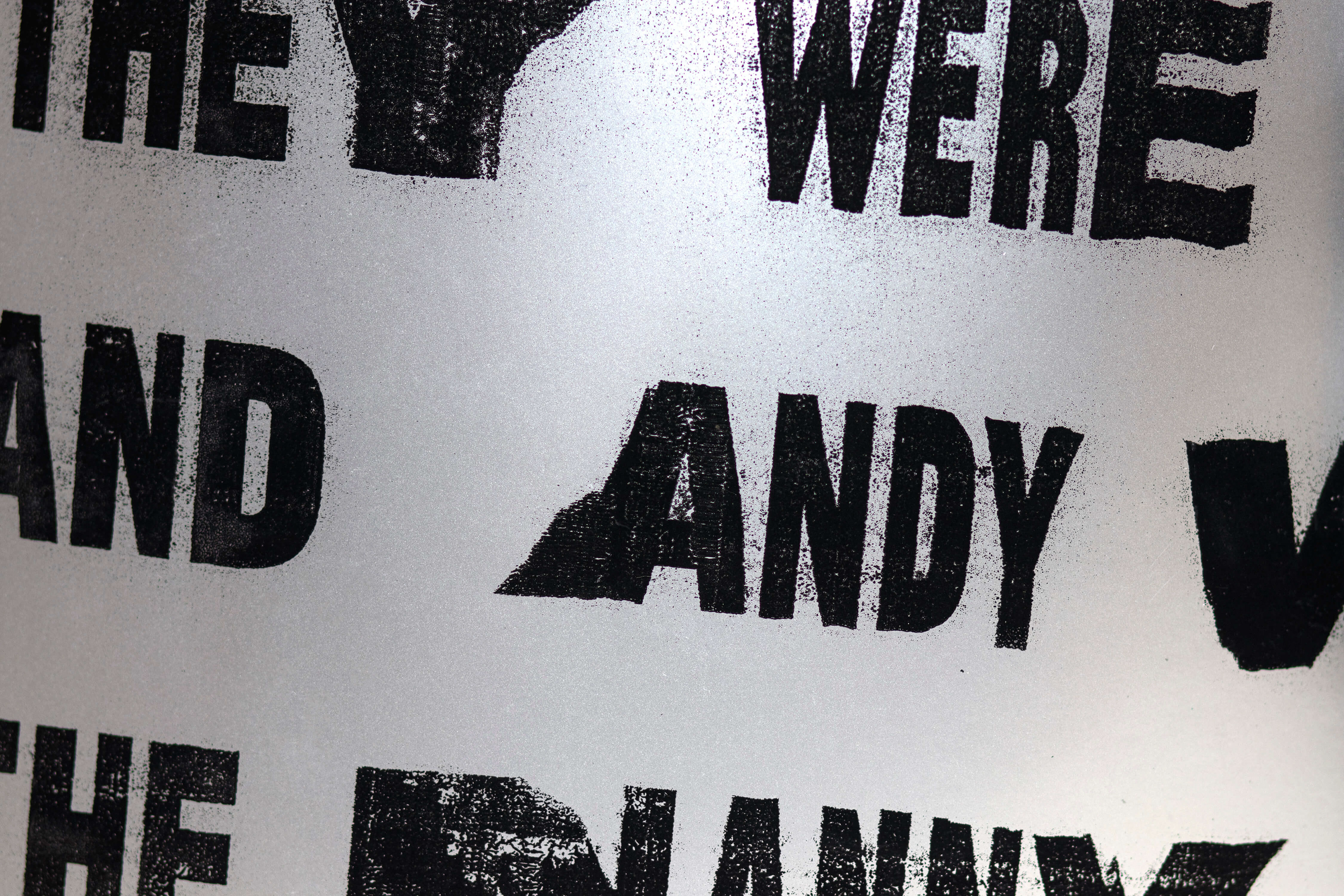
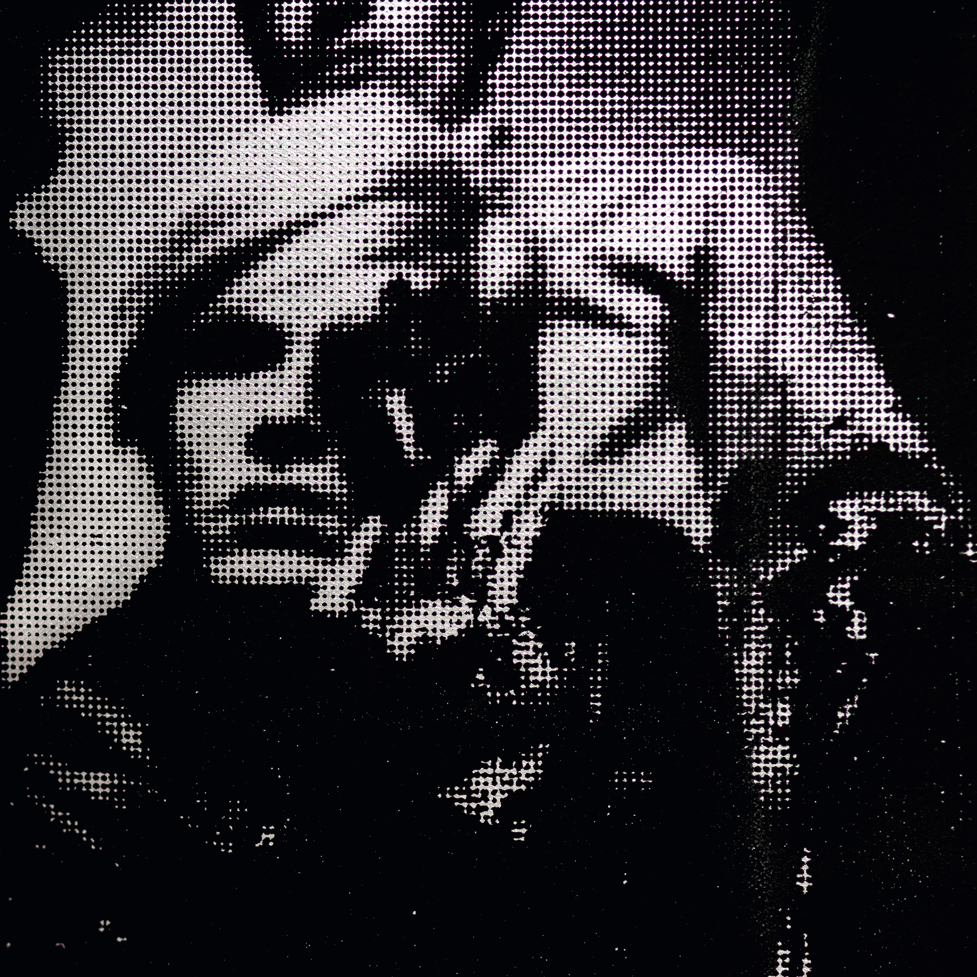
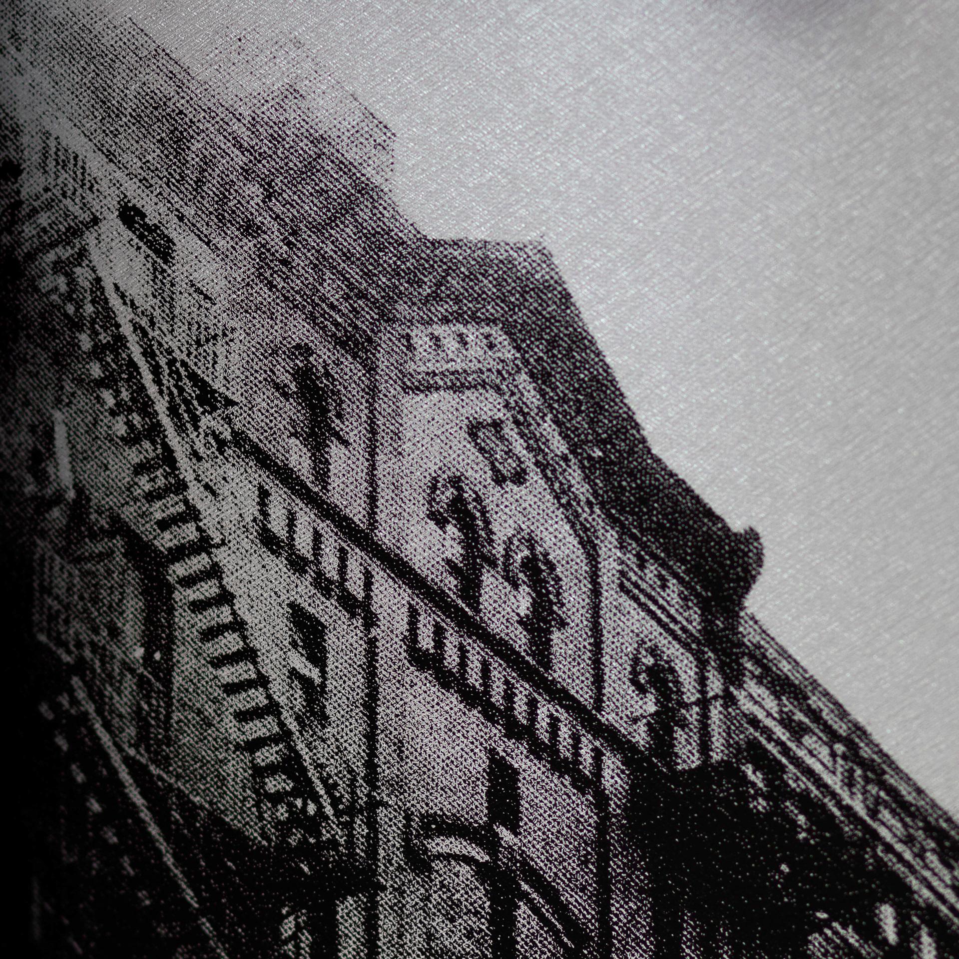
Silver Was the Future is a visual translation of Caroline Jones’ research comparing Andy Warhol’s Factory to a traditional factory. The physical location and symbolic name of Warhol's studio represented a shift in what it meant to be an artist in America. His work was characterized by consumerism—in both process and subject matter—and removal of the artist's hand. The book's visual language is rooted in industrialism and mass production, with a binding method that references Fortunato Depero’s Bolted Book and Knoll Group’s Knoll Celebrates 75 years of Bauhaus Design.
Typography
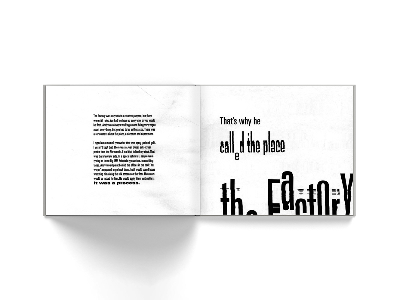
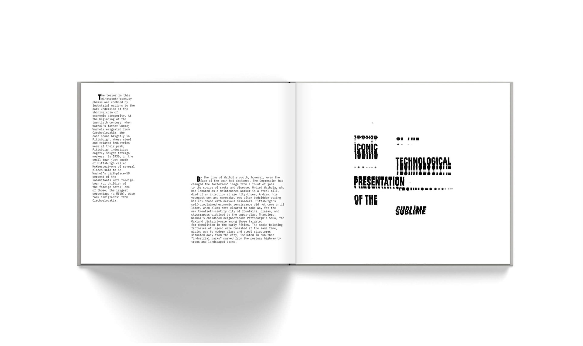
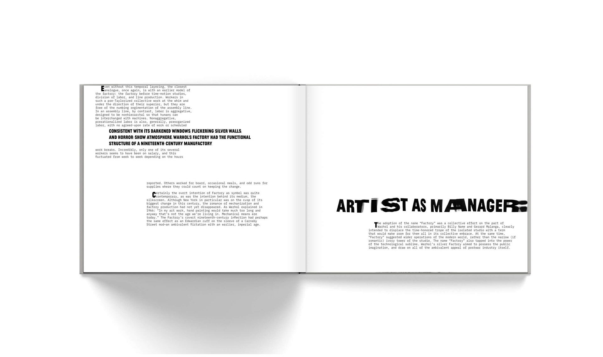
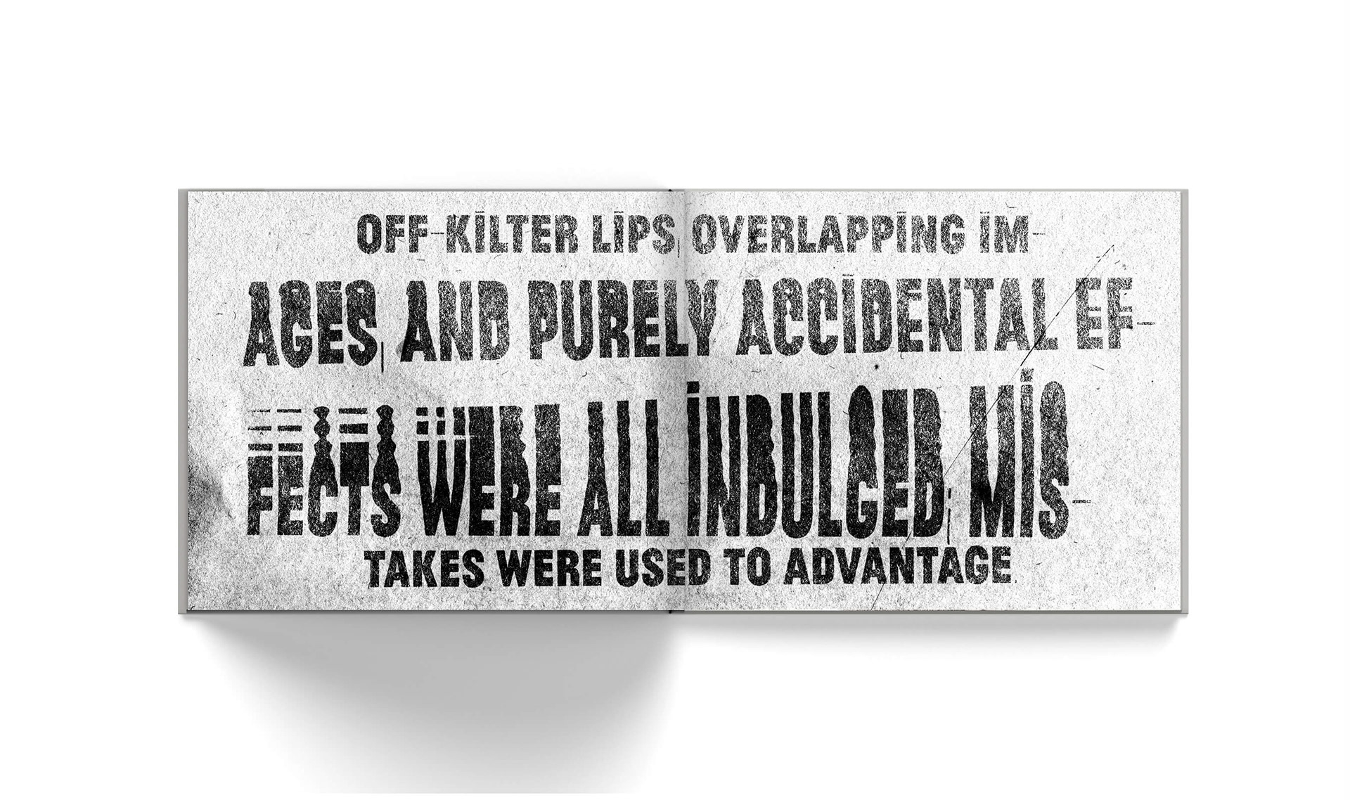
The typefaces used throughout this book reference the IBM Selectric typewriters used in the Factory for transcribing tapes. The electrophotographic and digitally manipulated typography serves as a nod to Warhol's Xerox Progressions and his connection to hand lettering as a commercial artist.

Machines have less problems.
I'd like to be a machine, wouldn't you?
I'd like to be a machine, wouldn't you?
—Andy Warhol
Silkscreen
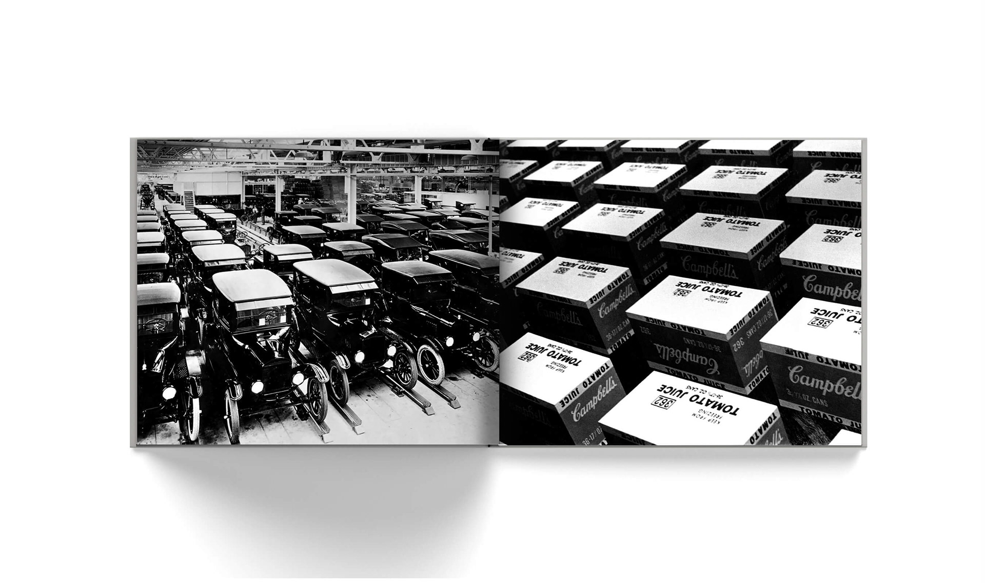
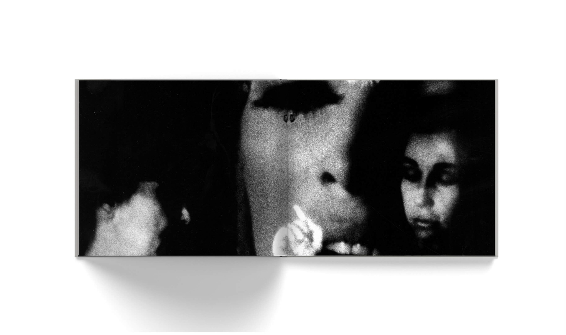
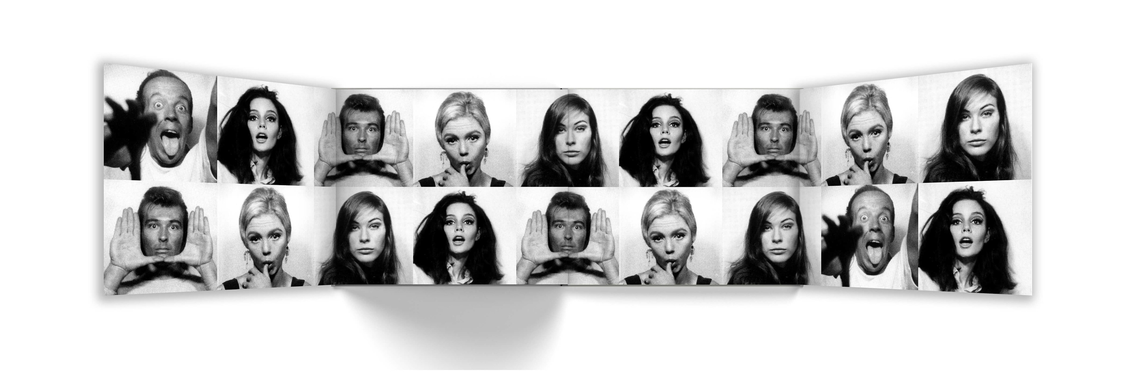
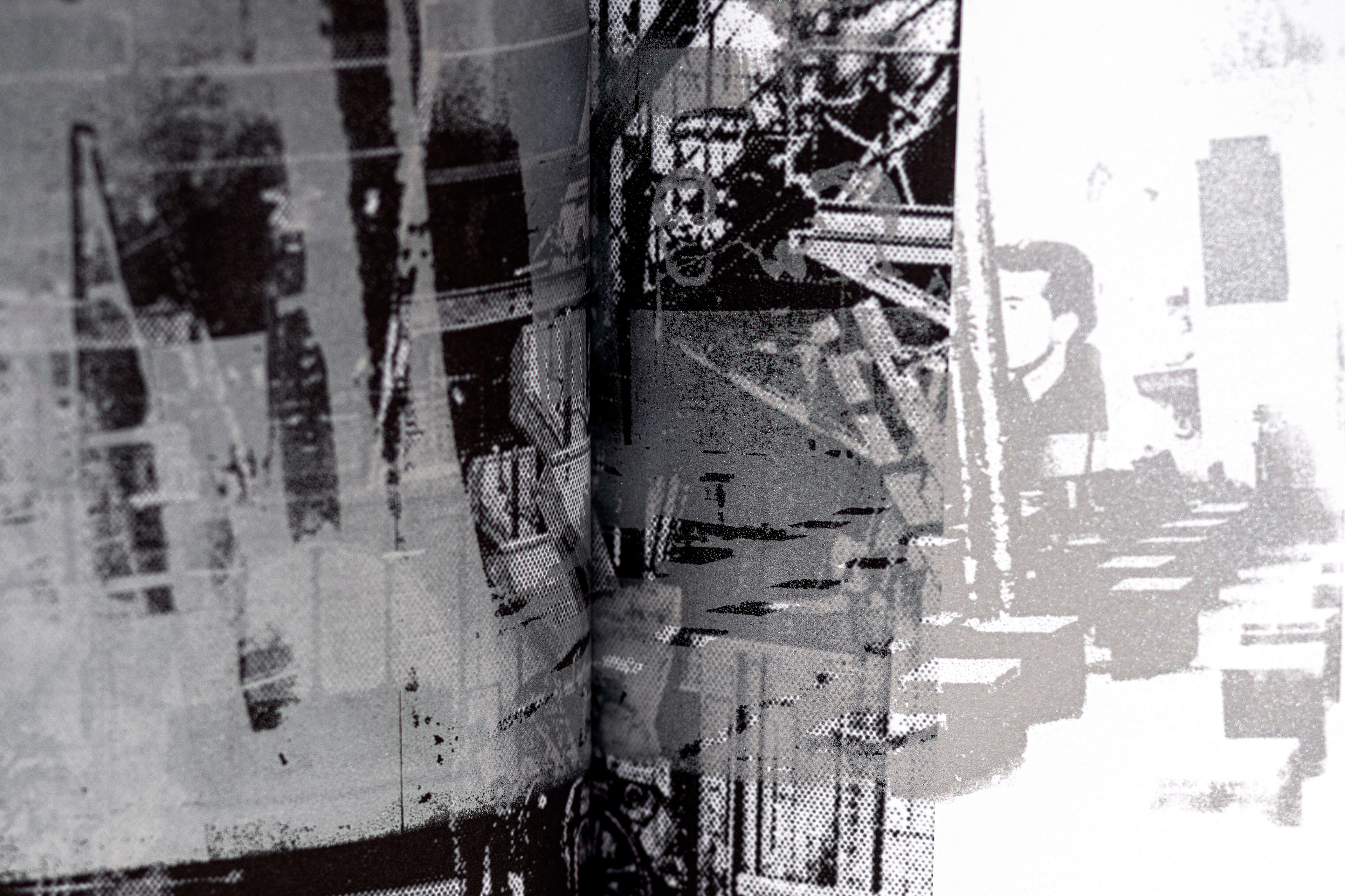
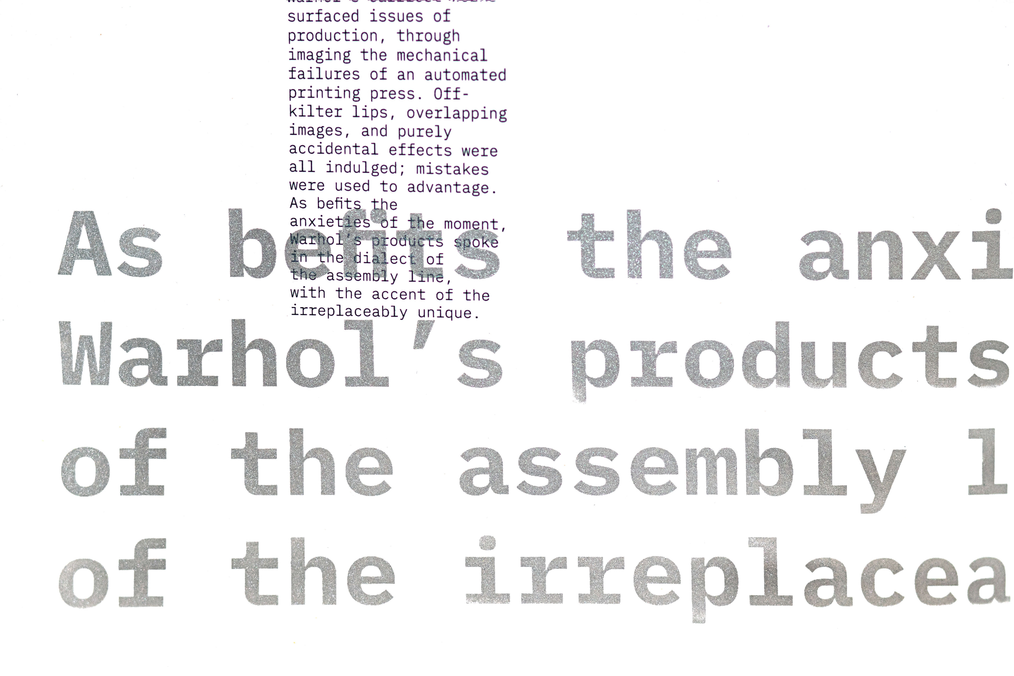
A significant portion of this book was screen-printed by hand to underscore the mechanics of Warhol's artistic process. Images of The Factory and its Superstars were printed in translucent silver ink, overlapping photographs of twentieth-century factories and their workers. Xerox-manipulated typography was also printed on silver stock throughout.
Student project. Not meant for publication or commercial use.